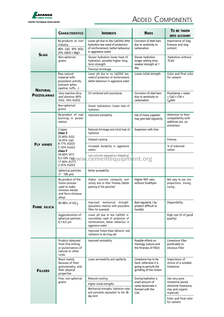
Table of Added Components: Cement Chemistry
The Tableau added components guide is the toolbox of the cement plant analyst: the component library of the dashboard designer: the filters that slice the data, the parameters that switch the scenarios, the calculated fields that translate the process variables into the business language and the sets that mark the exceptions: the guide of the package takes the production data of the cement plant, the kiln temperatures, the mill powers, the quality tests and the dispatch records, and shows how to assemble them into the dashboards that the management reads in thirty seconds: the analyst of the plant builds the reporting that the board follows.
The Complete Cement Technical Package (931 files including the books, the courses, the Excel tools and the dashboard workbooks: $249.99 one-time: instant download via the PayPal payment) includes the Tableau component guide with the workbook templates, the calculated field libraries and the sample dashboards of the cement KPIs: this article walks the document: the component inventory, the filters, the parameters, the calculated fields, the sets and the dashboard composition: the reader closes the page able to design the KPI screen of his own plant.
The cement plant produces a staggering volume of data: the process historians record thousands of tags every minute, the laboratory registers the daily tests, the dispatch systems log every truck: the data is abundant and the attention is scarce: the added components of Tableau solve the scarcity problem: they shape the raw stream into the focused views that answer the daily questions: how is the kiln running today against the plan, which mill drifts, which client buys the most, where does the energy go: the dashboard is the instrument of the answers, and the components are its precision parts.
1. The Component Inventory: The Parts of the Dashboard Machine
The guide opens with the inventory of the Tableau components that the cement analyst uses daily: the parts of the dashboard machine, listed with their functions and their typical cement applications:
- The data source components: the connections to the Excel files, the CSV exports and the databases: the joins, the unions and the blends that assemble the production, the quality and the dispatch tables into the single analytical model;
- The worksheet components: the dimensions, the measures, the continuous and the discrete fields: the shelf mechanics of the mark, the columns, the rows, the color, the size and the label encodings;
- The chart components: the line, the bar, the scatter, the heatmap and the Gantt: each chart answers the question it was built for: the time trend of the kiln, the comparison of the mills, the correlation of the fineness and the strength, the schedule of the maintenance;
- The interaction components: the filters, the parameters, the sets, the groups, the actions and the tooltips: the interactive layer that turns the static chart into the working instrument;
- The layout components: the containers, the text boxes, the images and the blank spaces: the visual grammar of the dashboard page: the hierarchy of the attention;
- The story components: the storyboard pages that sequence the analysis: the morning report that walks the management through the night’s performance: the story of the shift, told in the five pages;
The inventory is the vocabulary of the course: the later sections of the guide build the skills on these terms, and the analyst who learns the inventory first reads the rest of the document without the dictionary: the component map of the file is printed in the one-page overview that the trainees keep beside the desk during the first week of the Tableau work.
2. The Filters: The First Slicing Tool of the Analysis
The filter is the most used component of the dashboard: it limits the data to the relevant slice: the cement analyst filters the shifts, the silos, the kiln lines, the product types and the date ranges, and the guide covers the filter family completely:
- The dimension filters: the product type filter (CEM I 42.5, CEM II/A-LL, the sulfate-resisting class), the production line filter (Line 1, Line 2) and the shift filter (A, B, C, D): the categorical slicing of the analysis;
- The measure filters: the numeric conditions: the tests above the limit, the free lime above 2.0%, the Blaine outside the window of the product: the exception lists of the quality report;
- The date filters: the relative date ranges, the months to date, the quarters and the year-over-year comparisons: the seasonal analysis of the demand and the production;
- The context filters: the filter applied before the other filters compute: the performance-critical filter of the large datasets: the context discipline of the slow dashboards;
- The quick filters and the dashboard filters: the control cards on the dashboard page: the user selects the plant section or the product and the whole dashboard responds: the interactivity of the final product;
- The data source filters: the extraction-level exclusions that remove the irrelevant records before the analysis: the filter of the data governance: the analyst never deletes, always filters;
The filter design is a craft with its own rules, and the guide states the rules with the cement examples: the filter cards on the dashboard should not exceed the number the user can hold in mind, the default selection must be the management view, the hidden filters belong to the parameter-driven design: the disciplined dashboard answers the question with one click, the undisciplined one buries the answer under the controls: the component guide is the referee of the restraint.
3. The Parameters: The Switches of the Scenario
The parameter is the component that the cement analyst loves most, because it converts the dashboard into the simulator: the parameter is the user-defined variable that the calculations and the filters can reference: the scenario switch of the analysis:
- The energy price parameter: the analyst builds the cost-of-electricity calculation and binds it to the parameter: the management changes the price assumption from 0.05 to 0.09 USD per kWh and the whole energy cost dashboard recalculates: the sensitivity analysis of the electricity bill;
- The clinker price parameter: the dispatcher scenario of the purchase-vs-produce decision: the dashboard computes the breakeven of the clinker purchase against the own production cost: the parameter is the negotiation tool of the buyer;
- The fineness target parameter: the quality dashboard binds the residue and the Blaine targets to the parameters: the production meeting switches the view from the 42.5 target to the 52.5 target and sees the same shifts through the new lens: the product management instrument;
- The limit parameters: the alarm thresholds of the trends: the free lime limit, the SO3 limit and the temperature limits become the adjustable values instead of the hard-coded constants: the maintenance of the dashboard without the surgery;
- The date range parameters: the flexible period comparisons: the current month against the previous month, against the same month of the previous year: the switchboard of the time analysis;
- The parameter-driven filters: the top-N parameters: the management views the top 10 clients or the top 10 alarm events, and changes the N from the dropdown: the dynamic ranking of the dashboard;
The parameter discipline of the guide: every number that the management adjusts in the meeting should be a parameter, every number that the analyst computes once should stay a calculation: the parameterized dashboard survives the change of the assumptions without the rebuild: the file’s example workbook contains the full parameter library of the cement plant: the prices, the targets, the limits and the rates: the analyst copies the library and adapts it to the own plant in the hours instead of the weeks.
4. The Calculated Fields: The Process Language in the Tableau Grammar
The calculated field is the heart of the added components: the formula that transforms the raw process data into the KPI of the business: the cement analyst writes the calculated fields for the specific energy, the availability, the strength indexes and the inventory turnovers:
| Calculated field | Formula pattern | Unit | Management meaning |
|---|---|---|---|
| Specific heat consumption | Total fuel heat / clinker tons | MJ/kg clinker | The energy efficiency of the kiln line |
| Specific electrical energy | kWh (metered) / cement tons | kWh/t | The cost of the grinding and the transport |
| Availability of the line | Operating hours / calendar hours | % | The reliability of the production |
| Utilization of the kiln | Clinker tons / nominal capacity tons | % | The position against the capacity plan |
| Free lime deviation | Measured free lime − target | % CaO | The stability of the burning |
| Fineness compliance | IF residue within window THEN 1 ELSE 0 | Pass/fail | The quality of the day |
| Maintenance backlog | Open work orders / available hours | Hours | The load of the maintenance team |
The formula language of Tableau handles the cement calculations with the grace: the IF-THEN-ELSE for the compliance flags, the LOD (level of detail) expressions for the per-shift aggregates within the daily views, the table calculations for the running totals and the moving averages of the trends: the guide dedicates the full chapter to the LOD expressions because the cement data is hierarchical: the tests belong to the hours, the hours to the shifts, the shifts to the days, the days to the months: the LOD expression calculates at the correct level regardless of the dashboard granularity: the rookie mistake of the wrong-level aggregation produces the famous wrong averages, and the LOD chapter is the vaccination against it.
A worked example anchors the calculated field chapter: the specific electrical energy of the finish grinding: the raw data carries the hourly energy meter readings and the hourly production tons: the naive analyst divides the total kilowatt-hours of the month by the total tons of the month and produces one number; the precise analyst writes the field IF the meter hour matches the production hour THEN kWh / tons ELSE 0, and the LOD version that computes the ratio per day and then averages the daily ratios across the month: the two numbers differ measurably, and the difference is the weighting effect of the high-production days: the guide explains the two philosophies, the volume-weighted and the time-weighted, and the dashboard carries the calculation method in its tooltip so the reader of the KPI card knows exactly which arithmetic produced the number: the auditability of the reporting starts in the formula, and the formula chapter of the guide is the grammar book of that honesty.
5. The Sets and the Groups: The Marking of the Exceptions
The sets and the groups are the components that the beginners often skip and the professionals cannot live without: they mark the rows that share the property and enable the comparisons that the raw charts cannot show:
- The group: the manual clustering of the dimension members: the cement types grouped into the families, the clients grouped into the regions, the alarm codes grouped into the severity classes: the simplification of the categorical clutter;
- The constant set: the fixed membership of the marked items: the set of the critical equipment, the set of the premium clients, the set of the kilns of Line 2: the reference populations of the analysis;
- The computed set: the membership defined by the condition: the mills above the 95 kWh/t threshold, the products below the 90% compliance, the silos above the 85% filling: the dynamic exception lists that follow the data;
- The combined set: the union, the intersection and the difference of the sets: the clients who bought the premium cement AND the sulfate-resisting type: the logical power of the set algebra;
- The set actions: the dashboard interaction that updates the set membership when the user clicks: the click on the month bar selects the months and the scatterplot highlights the mills of that period: the cross-view exploration;
- The set application: the exception dashboards: the products in the top set are marked in green, the products outside in red: the management reads the screen as the traffic light: the exception principle of the industrial reporting;
The set-based reporting is the professional signature of the plant analyst: the daily KPI screen built on the computed sets answers the questions the static chart cannot: which mills enter the alarm window, which products carry the risk, which clients drift from the plan: the guide’s example workbook ships with the ready-made sets of the cement plant, and the trainees report that the set chapter changes the way they see the dashboard work entirely: the marking of the exceptions becomes the grammar of the analysis.
6. The Hierarchies and the Drill-Down: From the Plant to the Single Silo
The cement plant is a hierarchy, and the dashboard must navigate it: the hierarchy component of Tableau implements the drill-down from the plant level to the single piece of equipment:
- The organizational hierarchy: the company, the plant, the line, the section, the equipment: the analyst drills from the group balance to the single mill bearing temperature: the drill path of the accountability;
- The product hierarchy: the cement family, the type, the class, the silo lot: the dispatch analysis drills from the product family to the delivery batch: the traceability path of the quality;
- The time hierarchy: the year, the quarter, the month, the week, the day, the shift, the hour: the temporal drill of the trends: the year view hides the winter storm, the hour view reveals it;
- The geographic hierarchy: the country, the region, the city, the delivery point: the sales dashboard drills from the market to the single construction site: the territory map of the demand;
- The custom grouping of the drill: the analyst defines the drill levels that fit the plant organization, not the calendar defaults: the discipline of the custom hierarchy of the file’s workbook;
- The drill with the context: the drill-down that preserves the filters and the selections: the user navigates the levels without losing the slice: the continuity of the exploration;
The hierarchy design is the information architecture of the reporting: the well-designed drill tree lets the manager answer the question at the level where the question lives: the CEO asks about the quarter, the plant manager about the month, the shift leader about the hour: the same workbook serves all three, each at his level: the guide’s chapter on the hierarchy design includes the level-assignment table: which role drills to which depth, and which KPI belongs to which level: the table is the blueprint of the reporting structure of the plant.
7. The Dashboard Actions: The Interactivity of the Cross-View
The dashboard action is the component that connects the views: the selection in one chart filters or highlights the other charts of the page: the interactivity engine of the dashboard:
- The filter action: the click on the energy trend of the kiln filters the mill charts below to the same period: the click-through analysis of the correlated sections: the kiln and the mills explored together;
- The highlight action: the hover over the client bar highlights the same client in the product scatter: the visual linking without the data reduction: the exploration keeps the context;
- The URL action: the click opens the detail page or the historian link: the deep-dive navigation from the summary to the source: the dashboard as the gateway of the plant data;
- The set action: the click defines the set membership that the other views use: the exploration of the selection across the analysis: the exception marking of the interactive session;
- The parameter action: the click on the chart updates the parameter that the calculations use: the click on the product bar switches the fineness target of the quality view: the parameterized interaction;
- The action design rules: the actions follow the user journey, they never surprise: the guide’s rules of the action wiring: the target sheets, the clearing behavior and the performance budget;
The action design is where the dashboard becomes the instrument: the static report shows the facts, the action dashboard enables the interrogation: the management meeting on the action dashboard becomes the exploration session: the question leads to the chart, the chart leads to the question: the guide’s example of the energy board demonstrates the full action chain: from the total energy of the month to the hour of the waste, in the three clicks: the chain of the accountability, wired into the dashboard.
8. The Tooltips and the Text Components: The Explanation Layer
The dashboard must explain itself, and the tooltip is the explanation layer of the component design: the tooltip appears when the cursor rests on the mark, carrying the context that the chart cannot display:
- The KPI tooltip: the hover over the daily Blaine point shows the sample time, the product type, the silo and the target: the complete identity of the measurement: the context of the single point;
- The variance tooltip: the hover over the specific heat point shows the value against the plan, the variance and the direction: the management reads the deviation with the cause hints: the delta displayed at the point of attention;
- The mini-visualization tooltips: the sparkline inside the tooltip shows the hour trend behind the daily point: the depth without the navigation: the analyst embeds the mini-trend of the process historians;
- The instruction tooltip: the hover over the dashboard title explains the reading of the page: the guidance for the new users and the visitors: the onboarding layer of the dashboard;
- The calculation tooltip: the hover over the KPI card shows the formula and the data source of the number: the auditability of the reporting: the trust of the management in the numbers it reads;
- The text and the annotation components: the dashboards carry the conclusions, not only the charts: the analyst annotates the exceptions and the notes of the meeting: the dashboard as the living document of the decision;
The explanation layer is the difference between the chart and the report: the chart shows the drop of the clinker quality, the annotated dashboard tells the management that the drop correlates with the rainy week and the stopped kiln: the tooltip and the annotation components carry the analyst’s voice into the dashboard: the guide’s design rules keep the layer rich but restrained: the tooltip answers the first two questions of the user, the text boxes state the conclusion, and neither replaces the chart.
9. The KPI Cards and the Target Lines: The Language of the Scoreboard
The KPI card is the flagship component of the management dashboard: the single number with its trend, its target and its color: the scoreboard of the plant:
| KPI card | Typical target | Color logic | Source data |
|---|---|---|---|
| Clinker production | Plan tons/day | Green above 100% of the plan | Kiln line historian |
| Specific heat | 3.2 – 3.6 MJ/kg clinker | Amber above 3.6 | Fuel metering, production |
| Specific electrical energy | 90 – 110 kWh/t cement | Amber above 110 | Energy meters |
| Quality compliance | ≥ 95% of the tests in window | Red below 95% | Laboratory database |
| Kiln availability | ≥ 92% of the calendar time | Red below 92% | Shift logs, historian |
| Emergency stops | ≤ 2 per month | Red above 2 | Maintenance work orders |
| Lost-time incidents | 0 | Red at any number above 0 | Safety records |
The KPI card design follows the target line discipline: every card carries its target reference, either as the horizontal reference line on the trend or as the color threshold of the card: the green-amber-red logic follows the plant’s own alert rules, and the guide’s color table fixes the conventions so that the whole reporting system reads the same traffic light: the scoreboard page of the workbook assembles the cards in the management order: the safety first, the production, the energy, the quality, the maintenance: the order of the cards is the order of the values of the company.
The design of the individual card carries the detail that makes the difference: the big number in the top-left corner, the delta arrow against the previous period beside it, the mini-sparkline of the last 30 days underneath and the target reference line across the sparkline: the card answers the three questions of the manager in one glance: the current value, the direction and the position against the target: the guide’s card layout specification fixes the exact anatomy: the number size, the delta color convention (green for the favorable movement regardless of the sign of the number) and the sparkline horizon: the color convention deserves the emphasis, because the falling energy consumption is a green arrow, not a red one: the dashboard must speak the language of the business, not the language of the sign: the guide’s example cards of the workbook demonstrate the anatomy with the real cement numbers, and the analyst copies the card templates instead of reinventing the layout.
10. The Time Intelligence: The Trends, the Moving Averages and the Year-over-Year
The time is the fourth dimension of the cement business, and the time intelligence components of Tableau give the analyst the trend language of the plant:
- The continuous time axis: the hourly kiln temperature trend, the daily production trend and the monthly energy trend: the continuous axis reveals the shape of the process, the seasonality and the drifts;
- The moving averages: the 7-day and the 30-day moving averages smooth the daily noise of the quality and the energy data: the trend behind the scatter: the guide’s default window table recommends the smoothing horizons for the main KPIs;
- The year-over-year comparison: the same period of the previous year: the cement demand is seasonal, and the August of last year is the only fair comparison for the August of this year: the YoY component of the demand dashboards;
- The period-over-period deltas: the month against the previous month, the shift against the previous shift: the delta cards of the production meetings: the improvement and the deterioration in the single number;
- The forecasting components: the Tableau forecasting models on the production and the demand series: the planning horizon of the supply chain: the forecast with the confidence bands, read as the planning instrument and never as the promise;
- The date calculations: the days-in-month adjustments, the working-day normalization and the calendar effects: the fair comparison of the months with the different weekends: the arithmetic of the fair reporting;
The time intelligence section of the guide is the bridge between the raw time series and the management judgment: the process data becomes the trend story: the winter peak of the electricity price, the summer dip of the demand, the Easter effect on the dispatches: the analyst who masters the time components reads the plant calendar like the weather map, and the guide’s workbook provides the complete time-intelligence library ready to paste into the own dashboards.
The cement-specific calendar effects deserve the dedicated treatment because the industry calendar is not the general one: the maintenance shutdowns shift the production between the months, the year-end stockpiling distorts the December dispatches and the Ramadan effect shapes the demand of the markets of the Middle East and North Africa: the naive month-over-month comparison of the production misleads exactly in the transition months: the guide’s answer is the working-calendar adjustment: the analyst marks the shutdown periods and the holiday periods in the calendar dimension and the comparison fields exclude or normalize them: the dashboard then compares the comparable, the operating day against the operating day: the file’s chapter on the calendar effects is one of its most valued sections among the analysts of the exporting plants, where the client calendars differ from the producing country’s calendar, and the export dashboards must speak the calendar of each market.
11. The Performance Design: The Fast Dashboards of the Big Data
The cement plant data volumes grow with the automation, and the dashboard performance is a design discipline, not an accident: the guide’s performance chapter covers the component-level choices that keep the dashboards fast:
- The extracts: the Tableau data extracts replace the live connections where the freshness allows: the hourly extract of the process data serves the dashboards with the sub-second responses: the freshness-versus-speed balance of the reporting architecture;
- The context filters: the context filter on the date dimension reduces the working set before the other calculations run: the performance-critical filter of the large extracts: the discipline of the filter order;
- The reduced marks: the aggregation at the view level instead of the row-level details: the daily averages instead of the hourly points for the year-long trends: the honesty of the aggregation level, shown in the subtitle of the chart;
- The formula efficiency: the LOD and the table calculations rewritten to avoid the double computation: the guide’s formula tuning table shows the expensive patterns and their cheaper equivalents;
- The limit of the components: the number of the sheets and the actions on one dashboard: the performance budget of the page: the guide’s rule of the thumb: the dashboard under 5 seconds to load, under 1 second to interact;
- The monitoring: the workbook performance recorder of Tableau analyzes the slow views: the analyst finds the offending sheet and applies the fixes of the chapter: the measurement first, the optimization second;
The performance chapter closes the technical loop of the component guide: the dashboard that answers in seconds is the dashboard that is used, and the used dashboard is the one that changes the decisions: the slow workbook of the plant data is abandoned within the week, whatever its analytical brilliance: the guide’s performance budget gives the analyst the measurable target and the fix list to reach it.
12. The Workbook Architecture: The Structure of the Cement Reporting System
The final technical chapter assembles the components into the reporting architecture: the workbook structure of the cement plant analysis:
- The staging workbook: the data cleaning and the preparation workbook: the raw exports are checked, the duplicates are flagged and the calculated fields are validated before the analysis: the quality gate of the data pipeline;
- The analysis workbook: the exploration workbooks of the engineers: the kiln analysis, the mill analysis, the quality analysis: the working sheets of the process improvement: the place of the deep questions;
- The published dashboard: the polished dashboards for the management: the KPI scoreboard, the energy report, the quality report, the dispatch report: the component design of the sections 1 to 11 applied to the final products;
- The story workbook: the narrative pages for the meetings: the monthly review story that walks through the results, the causes and the actions: the storyboard component in the service of the management communication;
- The data governance: the naming conventions, the field dictionaries and the versioning: the same calculated field means the same thing in every workbook: the governance chapter of the guide prevents the Tower of Babel of the reporting;
- The maintenance plan: the quarterly review of the dashboards against the changing KPIs, the retiring of the obsolete views and the renewal of the targets: the living system of the reporting;
The architecture chapter is the professionalization of the analysis work: the components of the earlier chapters become the system of the plant: the same data feeds the engineer’s exploration and the board’s scoreboard, the same calculations mean the same thing in both worlds: the analyst of the cement plant grows from the chart maker to the information architect, and the guide’s final chapter marks the growth path with the concrete workbook templates.
The naming conventions of the governance deserve the closing emphasis of the chapter: the field dictionary of the guide fixes the vocabulary of the reporting: CLINKER_TONS means the production tons of the kiln in every workbook, SPECIFIC_HEAT means the megajoules per kilogram in the same units everywhere, and no workbook redefines the meaning with the local variation: the dictionary also fixes the unit conventions: the energy in megajoules per kilogram, the temperature in degrees Celsius, the fineness in square meters per kilogram: the mixed units are the classic error of the international plants, where one report quotes the BTU per pound and the other the megajoules per kilogram: the dictionary of the guide is the shield against the unit chaos, and the monthly review of the dashboards against the dictionary keeps the reporting system coherent as the plants and the people change.
13. Frequently Asked Questions
Do I need the programming knowledge to use the added components?
No: the Tableau components are visual and the formulas use the simple calculation language: the cement analyst with the Excel knowledge adapts within the week: the guide assumes the spreadsheet experience of the plant engineer and builds the components from there: the calculated fields of the guide ship ready-made for the cement KPIs, so the analyst starts from the working examples, not from the blank sheet.
Which Tableau version do the examples of the guide require?
The guide is written against the Tableau Desktop of the 2019 to 2023 era, and the examples use only the standard components that the public and the professional editions share: the extracts, the parameters, the sets and the actions of the examples run on the desktop editions without the server: the published dashboards of the final chapter optionally use the Tableau Server or Cloud, and the guide notes the deployment differences, but the analysis work of the file is fully local: the analyst of the plant with the desktop license alone completes the entire course.
How do the dashboards connect to the live process data?
Two roads: the direct database connection when the historian exposes the SQL interface, and the scheduled extract refresh for the export-based pipelines: the guide covers both with the cement examples: the live connection for the control-room screens and the extract refresh for the management reports: the freshness requirements decide the architecture: the thirty-second control view lives on the live connection, the monthly board lives on the refresh.
Which data sources does the cement plant connect to Tableau?
The typical plant connects the Excel quality registers, the CSV exports of the process historians and the SQL databases of the ERP and the LIMS: the guide covers the connection, the joining and the blending of the three worlds: the practical architecture of the file connects the historian exports with the quality database and the dispatch system into the single analytical model of the plant.
How long does it take to build the first cement KPI dashboard?
With the workbook templates of the package, the first complete KPI dashboard is assembled in a day: the filters and the parameter library are copied from the templates, the calculated fields are adapted to the plant’s data names and the layout is arranged from the example: the full reporting system of the sections, the monthly story and the governance takes the analyst two to three weeks of the part-time work.
Are the dashboards suitable for the non-technical management?
Yes: the component design of the guide is built for the reader with the thirty seconds: the KPI cards with the traffic-light colors, the tooltips that explain, and the drill-downs that the managers never need to drill: the design rules of the file keep the dashboards legible for the board while the same data remains accessible to the engineers: the dashboard serves both audiences with the same data and the different layers.
How do the Tableau components handle the quality data of the laboratory?
The laboratory data arrives as the test records: the sample time, the product, the silo and the results: the analyst reshapes the rows into the time series with the calculated fields, groups the tests into the shift and the daily aggregates, and flags the results against the limits with the IF-THEN-ELSE compliance fields: the quality dashboards of the guide demonstrate the full chain from the raw test row to the compliance card of the morning meeting.
14. Conclusion
The Tableau added components: the toolbox of the plant analyst: the filters, the parameters, the calculated fields, the sets, the hierarchies, the actions, the tooltips and the KPI cards: the components assemble into the dashboards that translate the process data into the management decisions: the specific heat on the scoreboard, the compliance in the traffic light, the drill-down to the single silo: the reporting system of the cement plant, built from the components of the guide and maintained by the discipline of the architecture.
The Complete Cement Technical Package includes the Tableau component guide with the workbook templates, the calculated field library and the sample dashboards of the cement KPIs: the 931 files, the one-time $249.99, the instant download: the analytical workbench of the package: the plant data, shaped into the decisions: the reporting of the cement plant, professionalized.
Get this Tableau components file + the full 931-file package
$249.99 — one-time purchase, instant download, lifetime access
This file is part of the Complete Cement Technical Package (931 files) available from cementequipment.org. Respective rights holders; library copy for the licensed single user.